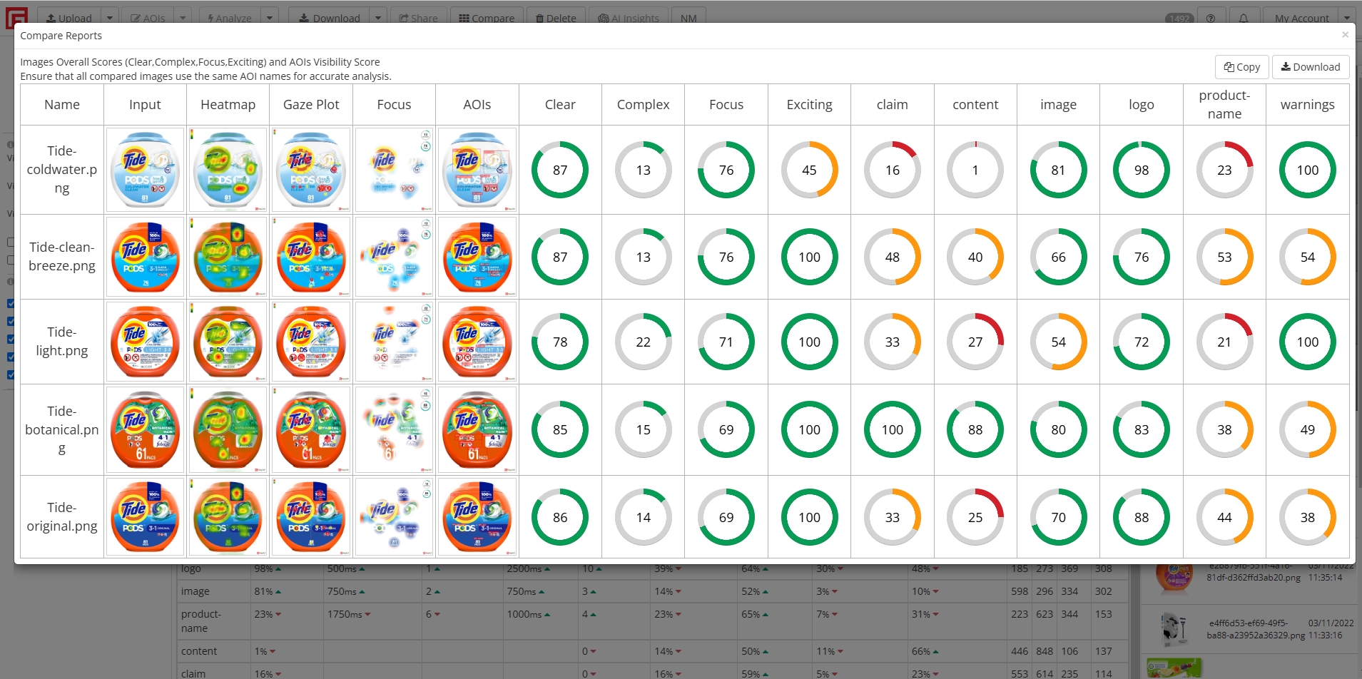
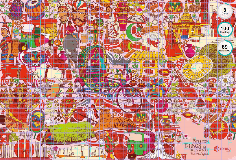
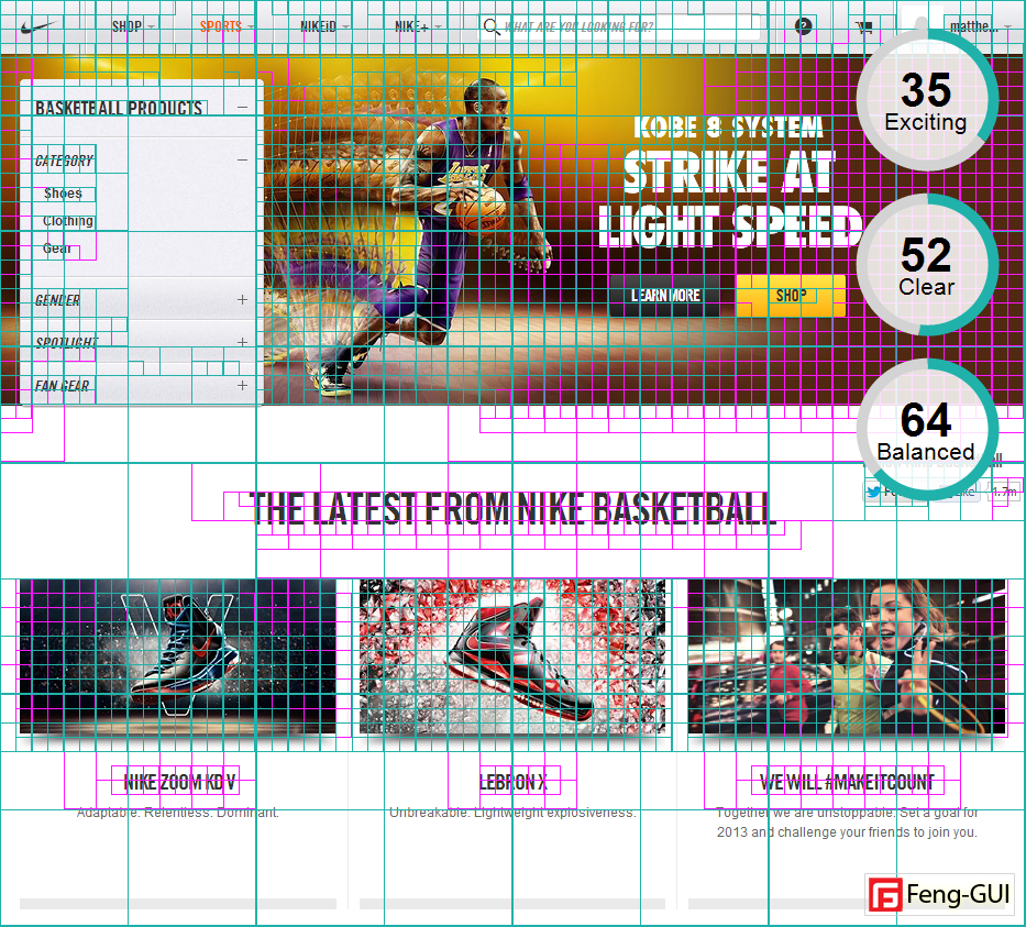
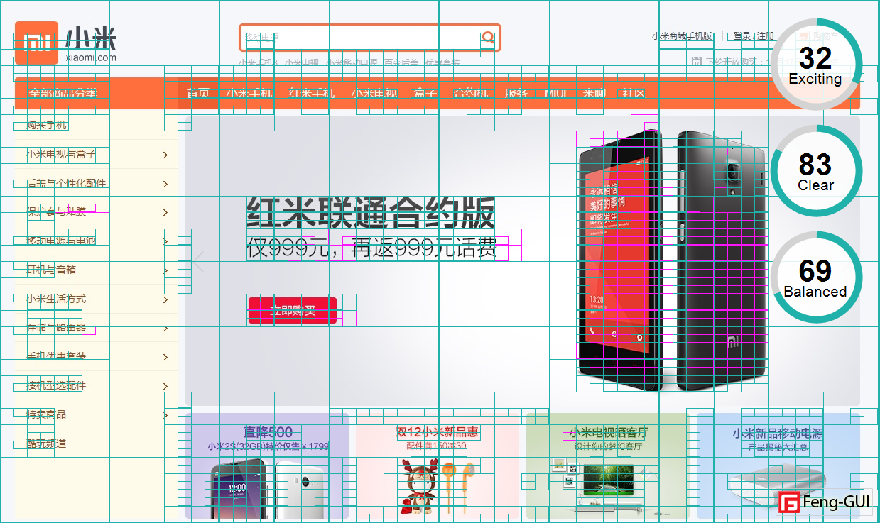
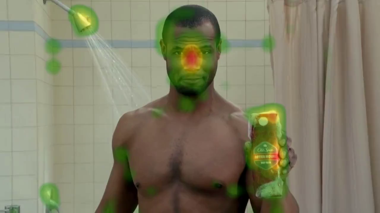
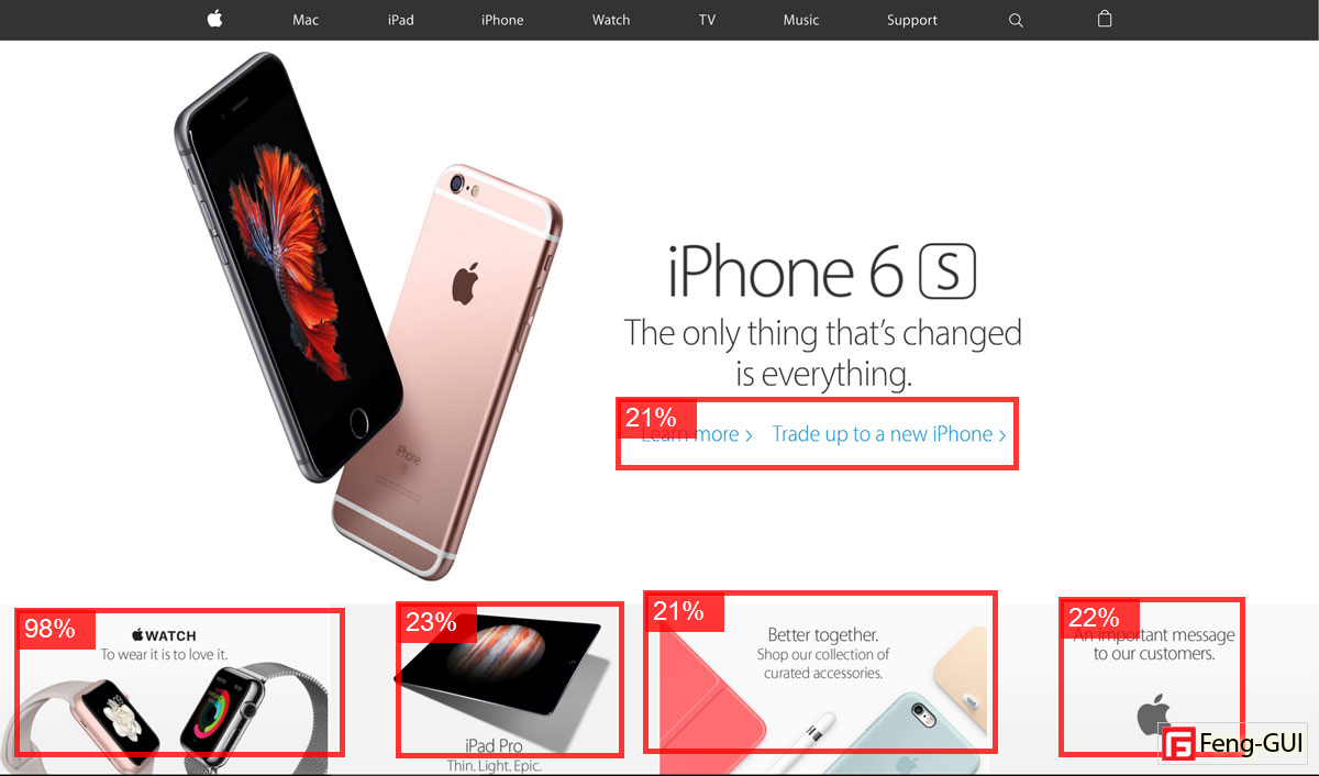
Areas of Interest (AOIs) help you focus your analysis on the parts of a stimulus that actually matter, rather than treating the entire image or video equally.
By defining specific regions, you can measure how much attention each element attracts and how quickly users notice it.
AOIs turn raw visual attention data into clear, comparable metrics—making it easier to evaluate design effectiveness and user engagement.
This targeted approach enables more actionable insights and more informed design decisions.
AOIs power the
AOIs Report, providing structured insights into visual engagement.
Their detailed metrics are also summarized in the
AOIs Data Table for easy comparison.
Create Auto AOIs
Applies only to images.
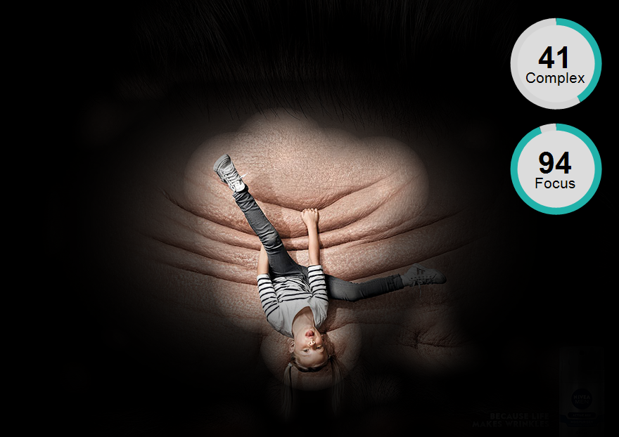
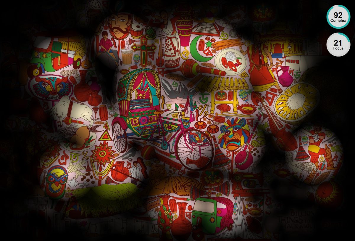
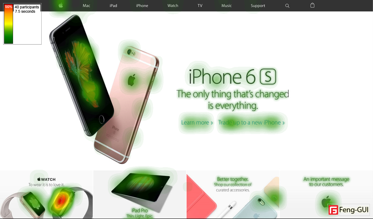
Create Auto AOIs automatically generates Areas of Interest based on the most prominent visual elements in your design.
Use this tool when you need a quick baseline analysis without having to manually draw measurement boundaries.
This saves you time and instantly reveals the specific layout regions naturally drawing the most human attention.
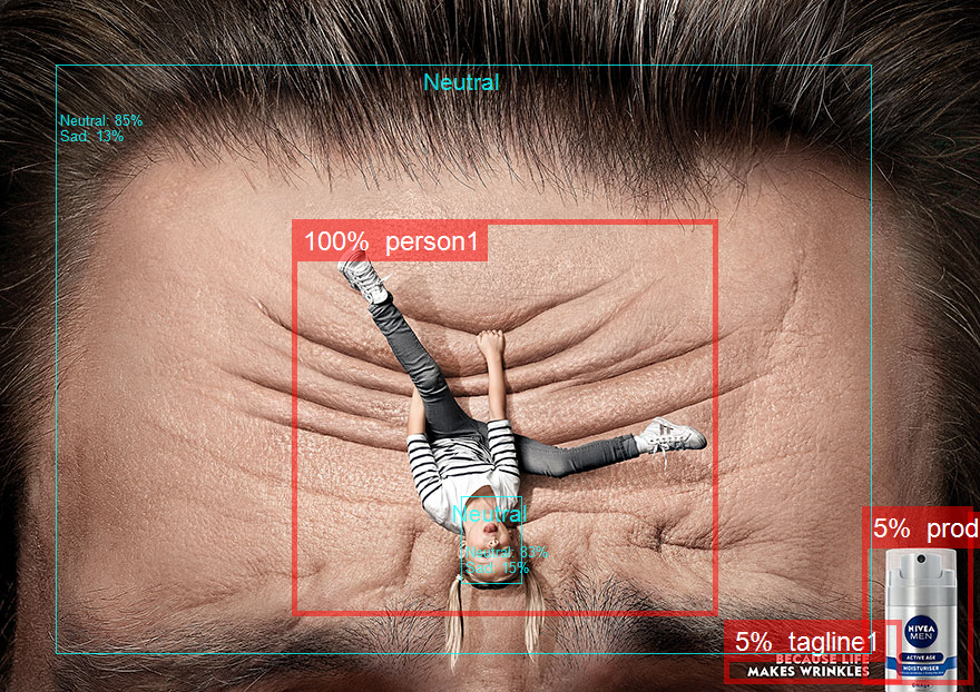
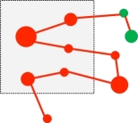
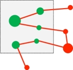
Automatic creation of Areas of Interest (AOIs) using object detection algorithms works by identifying key objects or elements in an image, such as faces, products, or text, using machine learning models.
These models scan the image, draw bounding boxes around detected objects, and automatically designate these areas as AOIs.
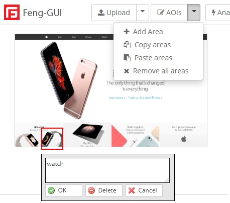
Add AOI
Applies only to images.
Add AOI lets you manually draw a custom measurement area anywhere on your uploaded image or layout.
This is ideal for tracking specific design components like call-to-action buttons, brand logos, or text blocks.
It gives you precise control to measure exactly how much visual attention your most important targets receive.
Delete AOI
Applies only to images.
Delete Area removes a single selected Area of Interest from your current testing workspace.
This helps you easily clean up unwanted selections or correct simple mistakes made during the creation process.
It keeps your overall analysis strictly focused and clutter-free by ensuring you only evaluate relevant visual zones.
Copy Areas
Applies only to images.
Copy Areas saves your currently selected Areas of Interest to your clipboard for later use.
This feature is perfect for when you need to analyze the exact same regions across multiple design variations.
It guarantees absolute consistency in your testing criteria while eliminating the need for repetitive manual drawing.
Paste Areas
Applies only to images.
Paste Areas places your previously copied Areas of Interest directly onto your currently active design.
Use this alongside the copy tool to easily apply standardized tracking boundaries to new iterations of a layout.
It significantly speeds up your A/B testing workflow and allows for highly accurate side-by-side performance comparisons.
Remove all areas
Applies only to images.
Remove all areas instantly clears every Area of Interest from your screen in a single action.
This is incredibly useful when you want to completely restart your analysis or shift focus to a new layout strategy.
It provides a fast blank slate so you can immediately begin testing entirely new elements without tedious manual deletion.

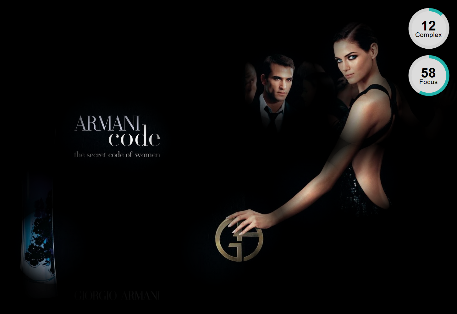


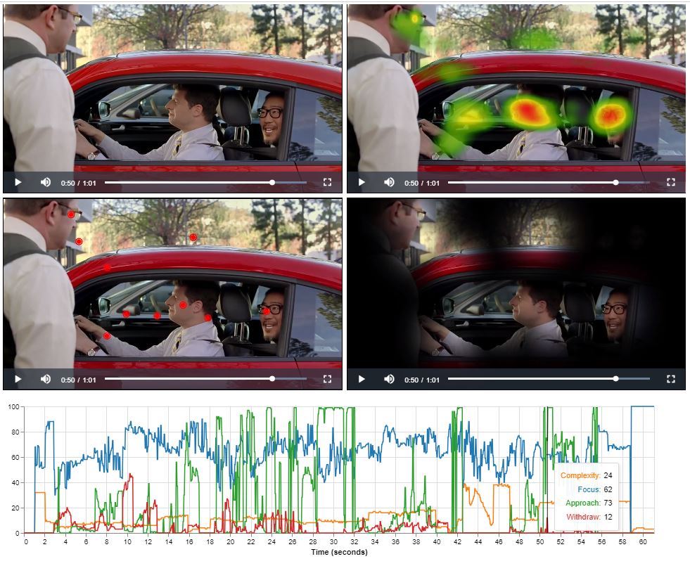 Analyzing a video frame by frame involves extracting Focus, Complexity, Approach and Withdraw scores to understand viewer attention and engagement.
This process segments the video, applies eye tracking algorithms to each frame, and extracts scores indicating where viewers focus, how they engage with complexity,
navigate through the content, and when they withdraw attention. These scores are then plotted on a timeline graph, with seconds along the x-axis and scores on the y-axis.
This visualization helps identify viewer behavior patterns and key moments, aiding in the optimization of video design and storytelling techniques for better viewer experience.
Analyzing a video frame by frame involves extracting Focus, Complexity, Approach and Withdraw scores to understand viewer attention and engagement.
This process segments the video, applies eye tracking algorithms to each frame, and extracts scores indicating where viewers focus, how they engage with complexity,
navigate through the content, and when they withdraw attention. These scores are then plotted on a timeline graph, with seconds along the x-axis and scores on the y-axis.
This visualization helps identify viewer behavior patterns and key moments, aiding in the optimization of video design and storytelling techniques for better viewer experience.